Ecompile’s New Color Identity
They say first impressions count. This is especially true when it comes to your brand since your brand color is likely to be the first thing customers see.
It wasn’t that much of a problem to choose the right color for Ecompile. We of course knew that we didn’t want go for red, pink or even green color, not because we don’t like these colors, I think all colors are great in general. However, if you know a little bit about color psychology, it makes it easier to choose the right color for your brand.
After researching a bit about color phycology and what’s best for our brand, we came to a conclusion that blue and white color would fit our brands perfectly.
Brands with great color schemes didn’t come across them by accident.
In our case, the tech business world mostly goes for white and blue colors, for example Facebook, Dell, PayPal and many more, and that’s because Blue calls to mind feelings of calmness or serenity. It is often described as peaceful, tranquil, secure, and orderly.
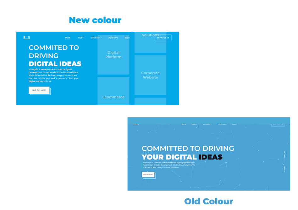
However, and after a very careful consideration, we came to a realization that we needed to choose a new shade of blue for our brand that reflects a more modern look and captures our mission better to deliver and bring widespread growth and build a better future for software development and solutions.
The new color evokes strong feeling of excitement and modernity. By this new brand color identity, we are hoping to reflect our mission better and clearly demonstrate what we are capable of, to serve you and your business better.
About the Author